High-frequency tick charts capture each trade transaction, delivering precise real-time market data for scalpers and day traders who require granular price movement analysis. Heikin-Ashi charts smooth out price fluctuations by averaging, enhancing trend detection and reducing market noise for swing traders and longer-term investors. Explore the distinct advantages of these chart types to optimize your trading strategy effectively.
Why it is important
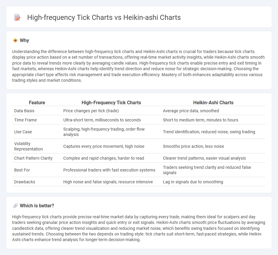
Understanding the difference between high-frequency tick charts and Heikin-Ashi charts is crucial for traders because tick charts display price action based on a set number of transactions, offering real-time market activity insights, while Heikin-Ashi charts smooth price data to reveal trends more clearly by averaging candle values. High-frequency tick charts enable precise entry and exit timing in fast markets, whereas Heikin-Ashi charts help identify trend direction and reduce noise for strategic decision-making. Choosing the appropriate chart type affects risk management and trade execution efficiency. Mastery of both enhances adaptability across various trading styles and market conditions.
Comparison Table
| Feature | High-Frequency Tick Charts | Heikin-Ashi Charts |
|---|---|---|
| Data Basis | Price changes per tick (trade) | Average price data, smoothed |
| Time Frame | Ultra-short term, milliseconds to seconds | Short to medium term, minutes to hours |
| Use Case | Scalping, high-frequency trading, order flow analysis | Trend identification, reduced noise, swing trading |
| Volatility Representation | Captures every price movement, high noise | Smooths price action, less noise |
| Chart Pattern Clarity | Complex and rapid changes, harder to read | Clearer trend patterns, easier visual analysis |
| Best For | Professional traders with fast execution systems | Traders seeking trend clarity and reduced false signals |
| Drawbacks | High noise and false signals; resource intensive | Lag in signals due to smoothing |
Which is better?
High-frequency tick charts provide precise real-time market data by capturing every trade, making them ideal for scalpers and day traders seeking granular price action insights and quick entry or exit signals. Heikin-Ashi charts smooth price fluctuations by averaging candlestick data, offering clearer trend visualization and reducing market noise, which benefits swing traders focused on identifying sustained trends. Choosing between the two depends on trading style: tick charts suit short-term, fast-paced strategies, while Heikin-Ashi charts enhance trend analysis for longer-term decision-making.
Connection
High-frequency tick charts capture price movements based on a specific number of trades, offering granular market activity insights for rapid decision-making. Heikin-Ashi charts smooth price data by averaging, reducing market noise and highlighting trends effectively. Combining these tools allows traders to leverage precise trade flow information from tick charts with the trend clarity provided by Heikin-Ashi visuals for enhanced trading strategies.
Key Terms
Candlestick Smoothing
Heikin-Ashi charts employ candlestick smoothing by averaging price data to filter out market noise and highlight clear trends, unlike high-frequency tick charts that capture every tick, leading to more granular but noisier data. Heikin-Ashi's smoothed candles provide traders with clearer entry and exit signals, enhancing trend identification and reducing false signals caused by market volatility. Discover how integrating Heikin-Ashi smoothing techniques can improve your trading strategy and market analysis.
Trade Frequency
Heikin-Ashi charts smooth price data by averaging open, close, high, and low prices, reducing market noise and offering clearer trend direction, which typically results in fewer but more reliable trade signals. High-frequency tick charts display every trade or price change, significantly increasing trade frequency and enabling traders to capitalize on rapid market fluctuations and liquidity changes. Explore detailed comparisons and strategies to optimize your trading frequency and decision-making by diving deeper into Heikin-Ashi versus high-frequency tick chart methodologies.
Signal Noise
Heikin-Ashi charts reduce signal noise by smoothing price data through averaged open, close, high, and low values, making trends easier to identify compared to traditional tick charts which display every high-frequency price movement. High-frequency tick charts capture all market activity ticks, offering granular insights useful for scalpers but often introducing considerable noise that can obscure trend clarity. Explore how each chart type influences trading decisions and noise filtering strategies for a deeper understanding.
Source and External Links
Heikin-Ashi chart - Wikipedia - Heikin-Ashi charts are Japanese trading indicators meaning "average bar" that smooth price data to reduce market noise and show trends more clearly, with studies showing they can predict market direction with about 72% accuracy and outperform traditional candlestick charts.
Understanding Heikin Ashi charts - TradingView - Heikin Ashi charts use averages of open, close, high, and low prices to create smoother candles that filter out short-term volatility and false signals, making trends easier to identify compared to traditional candlesticks.
Heikin-Ashi Candlesticks - ChartSchool - StockCharts.com - Heikin-Ashi candlesticks combine prior and current price data to reduce noise and better capture market trends, allowing traders to spot trending periods and reversal points more clearly than with standard candlesticks.