High-frequency tick charts capture market activity by plotting price changes after a specified number of trades, offering granular insights into trading volume and momentum. Time-based charts aggregate price movements over fixed intervals, such as minutes or hours, which can mask rapid fluctuations during volatile periods. Explore the nuances between these chart types to enhance your trading strategy and decision-making precision.
Why it is important
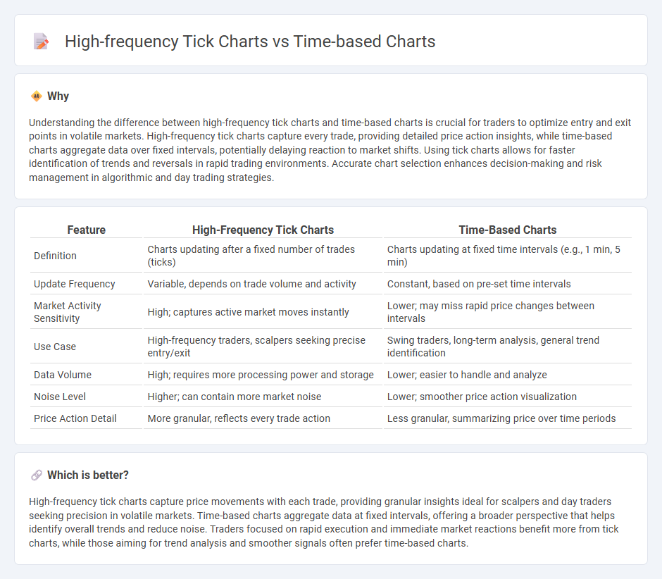
Understanding the difference between high-frequency tick charts and time-based charts is crucial for traders to optimize entry and exit points in volatile markets. High-frequency tick charts capture every trade, providing detailed price action insights, while time-based charts aggregate data over fixed intervals, potentially delaying reaction to market shifts. Using tick charts allows for faster identification of trends and reversals in rapid trading environments. Accurate chart selection enhances decision-making and risk management in algorithmic and day trading strategies.
Comparison Table
| Feature | High-Frequency Tick Charts | Time-Based Charts |
|---|---|---|
| Definition | Charts updating after a fixed number of trades (ticks) | Charts updating at fixed time intervals (e.g., 1 min, 5 min) |
| Update Frequency | Variable, depends on trade volume and activity | Constant, based on pre-set time intervals |
| Market Activity Sensitivity | High; captures active market moves instantly | Lower; may miss rapid price changes between intervals |
| Use Case | High-frequency traders, scalpers seeking precise entry/exit | Swing traders, long-term analysis, general trend identification |
| Data Volume | High; requires more processing power and storage | Lower; easier to handle and analyze |
| Noise Level | Higher; can contain more market noise | Lower; smoother price action visualization |
| Price Action Detail | More granular, reflects every trade action | Less granular, summarizing price over time periods |
Which is better?
High-frequency tick charts capture price movements with each trade, providing granular insights ideal for scalpers and day traders seeking precision in volatile markets. Time-based charts aggregate data at fixed intervals, offering a broader perspective that helps identify overall trends and reduce noise. Traders focused on rapid execution and immediate market reactions benefit more from tick charts, while those aiming for trend analysis and smoother signals often prefer time-based charts.
Connection
High-frequency tick charts and time-based charts are connected through their fundamental use of market data to represent price movements, with tick charts plotting trades at specific transaction counts and time-based charts marking price changes over fixed time intervals. Both chart types offer traders detailed insights into market liquidity and volatility, facilitating precision in entry and exit points for trading strategies. The integration of tick data within time frames enhances real-time analysis, allowing for better identification of trends and reversals in high-frequency trading environments.
Key Terms
Candlestick
Candlestick charts based on fixed time intervals provide a clear visualization of market trends by aggregating price movements into uniform segments, making them ideal for identifying long-term patterns. High-frequency tick candlestick charts capture every executed trade, offering granular insight into real-time market dynamics and short-term price fluctuations. Explore more to understand how each chart type influences trading strategies and market analysis.
Tick
Tick charts display price movements based on a set number of transactions, capturing market activity in real-time without the distortion of time intervals. High-frequency tick charts provide finer granularity by updating with each trade, making them ideal for scalpers and traders seeking to capitalize on immediate market fluctuations. Explore the advantages of tick-based charting for enhanced precision in trading strategies.
Volume
Time-based charts aggregate price data into fixed intervals, such as minutes or hours, which may obscure volume spikes during those periods. High-frequency tick charts update with every trade, providing detailed volume information and allowing traders to analyze market activity more precisely. Explore the nuances of volume analysis with these chart types to enhance your trading strategy.
Source and External Links
Create time-based charts - Splunk Docs - Time-based charts are created using the `timechart` command, which generates summary statistics over time with the x-axis representing time and the y-axis representing a count, field value, or statistical calculation; these charts commonly appear as line, area, or column charts and can split data into multiple series for comparison.
The Ultimate Guide To Time-based Data Visualization And Analysis - Time-based charts visualize changes in graph data over time, often using interactive tools like the "time bar" that combine histograms and trendlines to filter and explore temporal patterns in complex connected data.
Time Series Charts: How To Create & When To Use With Examples - Time series charts display data measured over time, useful for showing trends in large datasets; they are easy to create in Excel or BI platforms, especially when the date column is properly formatted, but they can be less effective with sparse data or overlapping patterns.