Footprint charts provide detailed market data by displaying volume, order flow, and price action at each price level, enabling traders to analyze market depth and buyer-seller activity more precisely than line charts. Line charts, on the other hand, offer a simplified view by connecting closing prices over a specified period, emphasizing overall price trends but lacking granular market insights. Explore how footprint charts can enhance your trading strategy with their in-depth market analysis capabilities.
Why it is important
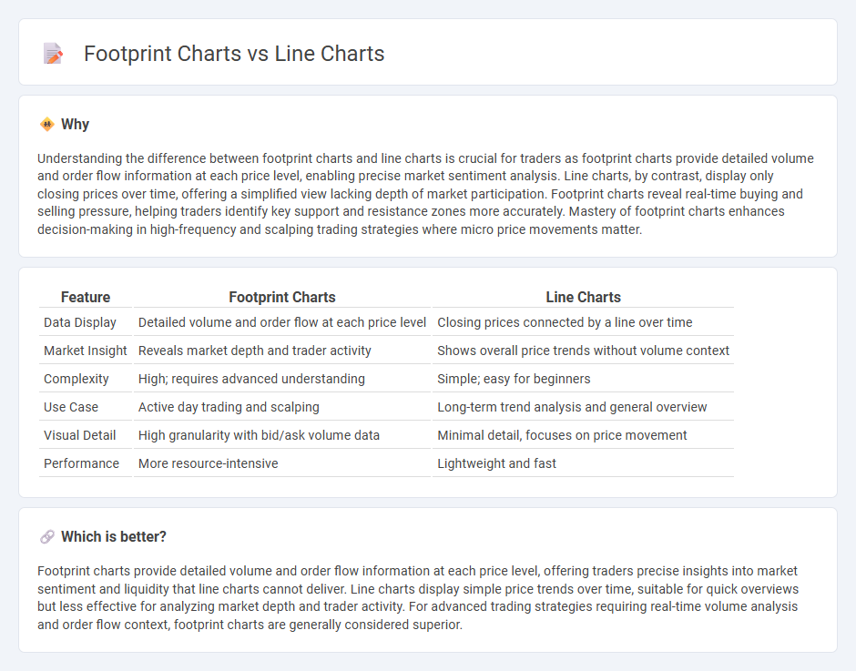
Understanding the difference between footprint charts and line charts is crucial for traders as footprint charts provide detailed volume and order flow information at each price level, enabling precise market sentiment analysis. Line charts, by contrast, display only closing prices over time, offering a simplified view lacking depth of market participation. Footprint charts reveal real-time buying and selling pressure, helping traders identify key support and resistance zones more accurately. Mastery of footprint charts enhances decision-making in high-frequency and scalping trading strategies where micro price movements matter.
Comparison Table
| Feature | Footprint Charts | Line Charts |
|---|---|---|
| Data Display | Detailed volume and order flow at each price level | Closing prices connected by a line over time |
| Market Insight | Reveals market depth and trader activity | Shows overall price trends without volume context |
| Complexity | High; requires advanced understanding | Simple; easy for beginners |
| Use Case | Active day trading and scalping | Long-term trend analysis and general overview |
| Visual Detail | High granularity with bid/ask volume data | Minimal detail, focuses on price movement |
| Performance | More resource-intensive | Lightweight and fast |
Which is better?
Footprint charts provide detailed volume and order flow information at each price level, offering traders precise insights into market sentiment and liquidity that line charts cannot deliver. Line charts display simple price trends over time, suitable for quick overviews but less effective for analyzing market depth and trader activity. For advanced trading strategies requiring real-time volume analysis and order flow context, footprint charts are generally considered superior.
Connection
Footprint charts and line charts are connected through their role in visualizing market data, with footprint charts providing detailed trade volume and order flow information at each price level, while line charts display overall price trends over time. Footprint charts enhance the interpretation of line charts by revealing the underlying market activity that drives price movements, offering traders a granular view of buyer and seller behavior. Integrating these charts enables more informed trading decisions by combining macro price trends with micro-level trade execution insights.
Key Terms
Price visualization
Line charts represent price movement over time by plotting closing prices, providing a clear and simple view of market trends. Footprint charts display detailed information like volume, bid-ask data, and order flow within each price bar, allowing traders to analyze market depth and buyer-seller dynamics. Explore the distinct advantages of each chart type to enhance your price visualization strategy.
Volume analysis
Line charts provide a clear visual of price trends over time but often lack detailed insights into market volume. Footprint charts integrate volume data directly with price action, revealing the exact traded volume at each price level and allowing traders to identify buying and selling pressure more accurately. Explore how footprint charts can enhance your volume analysis and improve trading decisions.
Order flow
Line charts provide a simplified visualization of price movements over time, making trends easy to identify but lacking detailed insights into market activity. Footprint charts reveal order flow by displaying volume and order execution at each price level, offering a granular view of buying and selling pressure. Explore how combining these tools enhances trading strategies and market analysis.
Source and External Links
Understanding and using Line Charts | Tableau - A line chart connects a series of data points using a line, typically with time on the horizontal axis and quantitative values on the vertical, useful for displaying trends and comparing multiple categories with colored lines for clarity.
What is a Line Chart? - Jaspersoft - Line charts visualize data points connected by lines, perfect for showing trends in time series or continuous data such as stock prices, sales figures, or temperature variations.
A Complete Guide to Line Charts | Atlassian - Line charts emphasize changes in one variable over continuous intervals of another, often time, and can display multiple lines for subgroup comparisons or frequency distributions called frequency polygons.