High-frequency tick charts capture every market transaction, providing granular insight into price movements and trader behavior, essential for scalping and algorithmic trading strategies. Line break charts filter price action by emphasizing trend reversals, helping traders identify shifts in market momentum without the noise of time-based intervals. Explore the unique advantages of both chart types to enhance your trading precision and decision-making.
Why it is important
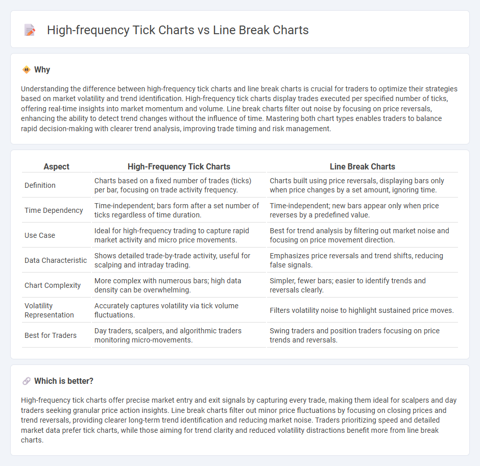
Understanding the difference between high-frequency tick charts and line break charts is crucial for traders to optimize their strategies based on market volatility and trend identification. High-frequency tick charts display trades executed per specified number of ticks, offering real-time insights into market momentum and volume. Line break charts filter out noise by focusing on price reversals, enhancing the ability to detect trend changes without the influence of time. Mastering both chart types enables traders to balance rapid decision-making with clearer trend analysis, improving trade timing and risk management.
Comparison Table
| Aspect | High-Frequency Tick Charts | Line Break Charts |
|---|---|---|
| Definition | Charts based on a fixed number of trades (ticks) per bar, focusing on trade activity frequency. | Charts built using price reversals, displaying bars only when price changes by a set amount, ignoring time. |
| Time Dependency | Time-independent; bars form after a set number of ticks regardless of time duration. | Time-independent; new bars appear only when price reverses by a predefined value. |
| Use Case | Ideal for high-frequency trading to capture rapid market activity and micro price movements. | Best for trend analysis by filtering out market noise and focusing on price movement direction. |
| Data Characteristic | Shows detailed trade-by-trade activity, useful for scalping and intraday trading. | Emphasizes price reversals and trend shifts, reducing false signals. |
| Chart Complexity | More complex with numerous bars; high data density can be overwhelming. | Simpler, fewer bars; easier to identify trends and reversals clearly. |
| Volatility Representation | Accurately captures volatility via tick volume fluctuations. | Filters volatility noise to highlight sustained price moves. |
| Best for Traders | Day traders, scalpers, and algorithmic traders monitoring micro-movements. | Swing traders and position traders focusing on price trends and reversals. |
Which is better?
High-frequency tick charts offer precise market entry and exit signals by capturing every trade, making them ideal for scalpers and day traders seeking granular price action insights. Line break charts filter out minor price fluctuations by focusing on closing prices and trend reversals, providing clearer long-term trend identification and reducing market noise. Traders prioritizing speed and detailed market data prefer tick charts, while those aiming for trend clarity and reduced volatility distractions benefit more from line break charts.
Connection
High-frequency tick charts and line break charts both analyze market price movements but focus on different data aspects; tick charts record price changes based on a set number of trades, capturing real-time market activity, while line break charts emphasize trends by plotting price changes only when they surpass previous highs or lows, filtering out minor fluctuations. Traders use high-frequency tick charts to detect short-term price momentum and volume spikes crucial for executing rapid trades, whereas line break charts help identify trend reversals and clearer support and resistance levels. Combining these chart types enhances trading strategies by merging detailed transaction data with refined trend analysis, leading to more informed decision-making in volatile markets.
Key Terms
Trend Reversal (Line Break Charts)
Line break charts emphasize trend reversals by filtering out minor price fluctuations, displaying only changes that meet specific reversal criteria, making it easier to identify shifts in market sentiment. High-frequency tick charts capture every trade within very short intervals, providing detailed price action but often generating noise that can obscure clear reversal signals. Discover how line break charts can enhance your trading strategy by offering a clearer perspective on trend reversal.
Tick Data Granularity (High-Frequency Tick Charts)
High-frequency tick charts utilize granular tick data that captures every market transaction, enabling traders to analyze price movements with precise temporal resolution and make timely decisions. Line break charts, by contrast, emphasize price reversals through filtering noise, offering a simplified view without relying on fixed time intervals or tick counts. Explore the nuances of tick data granularity and its impact on charting strategies to enhance your trading approach.
Noise Filtering
Line break charts filter market noise by emphasizing price action changes over fixed time intervals, reducing false signals from minor fluctuations. High-frequency tick charts capture every trade, providing granular data but often amplifying noise, requiring advanced filtering techniques for clarity. Explore how effective noise filtering enhances trading precision with line break and tick charts.
Source and External Links
Introduction to line break charts - TradingView - Line break charts are Japanese price-focused charts that form up and down lines based on whether closing prices break past the high or low of previous lines, typically looking back 3 lines to decide trend changes or continuations.
Introduction to Line-break chart - Definedge Shelf - Three-line break charts show vertical lines representing price movement, where a new bearish line forms only if the price drops below the lowest point of the last three bullish lines, and vice versa for bullish lines.
Line break chart - Wikipedia - Line break charts, known as three-line break charts, use price action without time intervals and exclude wicks, with lines colored differently to represent up and down trends, evolving only when price reversals break the prior line range.