High-frequency tick charts capture each individual trade, providing real-time insights into market microstructure and enabling traders to spot precise entry and exit points. Candlestick charts aggregate price data into fixed time intervals, highlighting broader market trends and patterns valuable for longer-term decision-making. Explore how understanding the nuances between tick and candlestick charts can enhance your trading strategy.
Why it is important
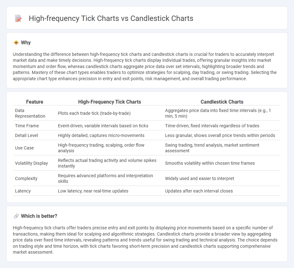
Understanding the difference between high-frequency tick charts and candlestick charts is crucial for traders to accurately interpret market data and make timely decisions. High-frequency tick charts display individual trades, offering granular insights into market momentum and order flow, whereas candlestick charts aggregate price data over set intervals, highlighting broader trends and patterns. Mastery of these chart types enables traders to optimize strategies for scalping, day trading, or swing trading. Selecting the appropriate chart type enhances precision in entry and exit points, risk management, and overall trading performance.
Comparison Table
| Feature | High-Frequency Tick Charts | Candlestick Charts |
|---|---|---|
| Data Representation | Plots each trade tick (trade-by-trade) | Aggregates price data into fixed time intervals (e.g., 1 min, 5 min) |
| Time Frame | Event-driven, variable intervals based on ticks | Time-driven, fixed intervals regardless of trades |
| Detail Level | Highly detailed, captures micro-movements | Less granular, shows overall price trends within periods |
| Use Case | High-frequency trading, scalping, order flow analysis | Swing trading, trend analysis, market sentiment assessment |
| Volatility Display | Reflects actual trading activity and volume spikes instantly | Smooths volatility within chosen time frames |
| Complexity | Requires advanced platforms and interpretation skills | Widely used and easier to interpret |
| Latency | Low latency, near real-time updates | Updates after each interval closes |
Which is better?
High-frequency tick charts offer traders precise entry and exit points by displaying price movements based on a specific number of transactions, making them ideal for scalping and algorithmic strategies. Candlestick charts provide a broader view by aggregating price data over fixed time intervals, revealing patterns and trends useful for swing trading and technical analysis. The choice depends on trading style and time horizon, with tick charts favoring short-term precision and candlestick charts supporting comprehensive market assessment.
Connection
High-frequency tick charts and candlestick charts are interconnected as they both visualize trading activity, with tick charts capturing every transaction in real-time to portray market microstructure, while candlestick charts aggregate price data over fixed intervals to reveal broader price trends. Tick charts enhance precision in identifying micro-movements by plotting each trade, facilitating scalping and short-term strategies. Combining tick data with candlestick patterns enables traders to better analyze market momentum, liquidity, and volatility for optimized trading decisions.
Key Terms
Timeframe
Candlestick charts aggregate price data into fixed time intervals like minutes, hours, or days, providing a clear snapshot of market trends and patterns over broader periods. High-frequency tick charts capture each individual trade regardless of time, offering a more granular and real-time view of market activity especially useful for scalping and high-frequency trading strategies. Explore the differences further to determine which chart type best suits your trading style and timeframe needs.
Granularity
Candlestick charts display price movements using aggregated time intervals, often ranging from minutes to days, providing a broader overview with clear open, high, low, and close values. High-frequency tick charts capture every transaction or a fixed number of trades, offering ultra-fine granularity and real-time insights into market microstructure. Explore the nuances of these charting techniques to enhance your trading strategy's precision and timing.
Market Noise
Candlestick charts aggregate price data into fixed intervals, smoothing out short-term fluctuations and reducing market noise for clearer trend analysis, whereas high-frequency tick charts record each trade, capturing granular price movements but often amplifying market noise. Traders leverage candlestick charts for identifying patterns and key support-resistance levels, while tick charts aid in detecting rapid trading activities and microstructure dynamics amidst noisy data. Explore further to understand how each chart type impacts trading strategies and noise filtration.
Source and External Links
Candlestick chart - Wikipedia - A candlestick chart is a financial chart style used to show price movements of securities, displaying open, close, high, and low prices for a specific time, often used in technical analysis for trading patterns.
40 Powerful Candlestick Patterns: Trading Guide for Beginners - Strike - Describes key candlestick patterns like the Morning Star, which signals a bullish reversal with about a 65% success rate, highlighting their role in predicting market trends.
16 Candlestick Patterns Every Trader Should Know | IG International - Explains popular candlestick patterns including Piercing Line and Morning Star, showing how these patterns indicate market sentiment shifts and potential reversals to traders.