Data visualization dashboards transform accounting data into interactive visual formats, enabling real-time monitoring of financial performance and key metrics. Pivot tables summarize vast datasets, facilitating detailed analysis and quick identification of trends within accounting records. Explore the benefits and use cases of both tools to enhance your accounting insights.
Why it is important
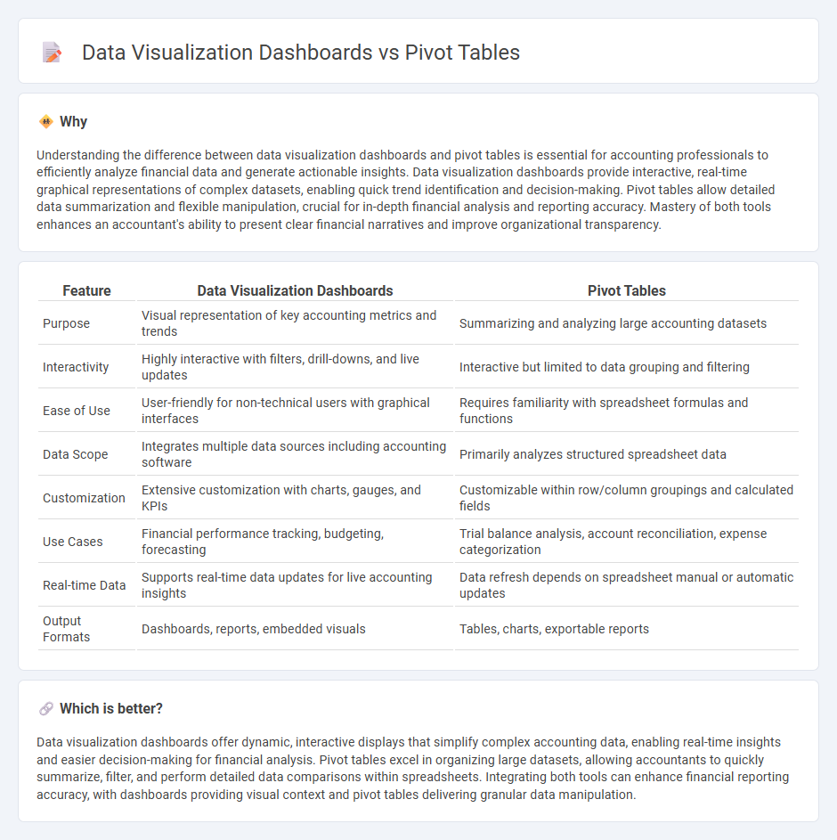
Understanding the difference between data visualization dashboards and pivot tables is essential for accounting professionals to efficiently analyze financial data and generate actionable insights. Data visualization dashboards provide interactive, real-time graphical representations of complex datasets, enabling quick trend identification and decision-making. Pivot tables allow detailed data summarization and flexible manipulation, crucial for in-depth financial analysis and reporting accuracy. Mastery of both tools enhances an accountant's ability to present clear financial narratives and improve organizational transparency.
Comparison Table
| Feature | Data Visualization Dashboards | Pivot Tables |
|---|---|---|
| Purpose | Visual representation of key accounting metrics and trends | Summarizing and analyzing large accounting datasets |
| Interactivity | Highly interactive with filters, drill-downs, and live updates | Interactive but limited to data grouping and filtering |
| Ease of Use | User-friendly for non-technical users with graphical interfaces | Requires familiarity with spreadsheet formulas and functions |
| Data Scope | Integrates multiple data sources including accounting software | Primarily analyzes structured spreadsheet data |
| Customization | Extensive customization with charts, gauges, and KPIs | Customizable within row/column groupings and calculated fields |
| Use Cases | Financial performance tracking, budgeting, forecasting | Trial balance analysis, account reconciliation, expense categorization |
| Real-time Data | Supports real-time data updates for live accounting insights | Data refresh depends on spreadsheet manual or automatic updates |
| Output Formats | Dashboards, reports, embedded visuals | Tables, charts, exportable reports |
Which is better?
Data visualization dashboards offer dynamic, interactive displays that simplify complex accounting data, enabling real-time insights and easier decision-making for financial analysis. Pivot tables excel in organizing large datasets, allowing accountants to quickly summarize, filter, and perform detailed data comparisons within spreadsheets. Integrating both tools can enhance financial reporting accuracy, with dashboards providing visual context and pivot tables delivering granular data manipulation.
Connection
Data visualization dashboards and pivot tables are connected through their ability to transform complex accounting data into clear, actionable insights by summarizing and organizing large datasets. Pivot tables aggregate financial transactions, allowing accountants to analyze trends, variances, and key performance indicators efficiently. These summarized datasets feed into dashboards, where interactive charts and graphs provide real-time visualization, enhancing decision-making and financial reporting accuracy.
Key Terms
Data Aggregation
Pivot tables excel in data aggregation by allowing users to quickly summarize large datasets through sorting, counting, and totaling operations, making complex data more digestible. Data visualization dashboards build on these aggregations by presenting the summarized information in interactive charts and graphs, enhancing pattern recognition and decision-making. Explore how combining pivot tables with visualization tools can optimize your data analysis strategy.
Key Performance Indicators (KPIs)
Pivot tables enable detailed analysis and summarization of KPIs by allowing dynamic data manipulation and filtering to identify trends and outliers efficiently. Data visualization dashboards present KPIs through interactive charts and graphs, facilitating quick decision-making and real-time monitoring of business performance. Explore how integrating both tools can enhance your KPI tracking and strategic insights.
Drill-Down Analysis
Pivot tables enable users to perform detailed drill-down analysis by aggregating and summarizing large datasets, allowing exploration of underlying data through dynamic filtering and slicing. Data visualization dashboards present complex information visually, offering interactive charts and graphs that facilitate quick identification of trends and patterns but may limit granular data examination. Explore the unique capabilities of pivot tables and dashboards for enhanced data-driven decision-making.
Source and External Links
Pivot table - Wikipedia - A pivot table is a type of table that summarizes large datasets by aggregating, categorizing, and pivoting data fields to highlight trends and patterns.
Introduction Excel PivotTable - W3Schools - PivotTables in Excel allow users to organize, rearrange, filter, and calculate data dynamically, making it easier to analyze complex information through interactive tables.
Pivot Tables in Excel - Step by Step Tutorial - Excel Easy - Pivot tables enable users to extract key insights from large datasets by dragging and dropping fields into rows, columns, values, and filters for customized summaries and reports.