Real-time data storytelling transforms raw information into compelling narratives that provide immediate context and drive informed decision-making, surpassing traditional data visualization's static charts and graphs. This dynamic approach leverages live data streams and contextual insights to engage stakeholders, enabling proactive responses to evolving business scenarios. Explore how integrating real-time storytelling can elevate your consulting strategies and client communications.
Why it is important
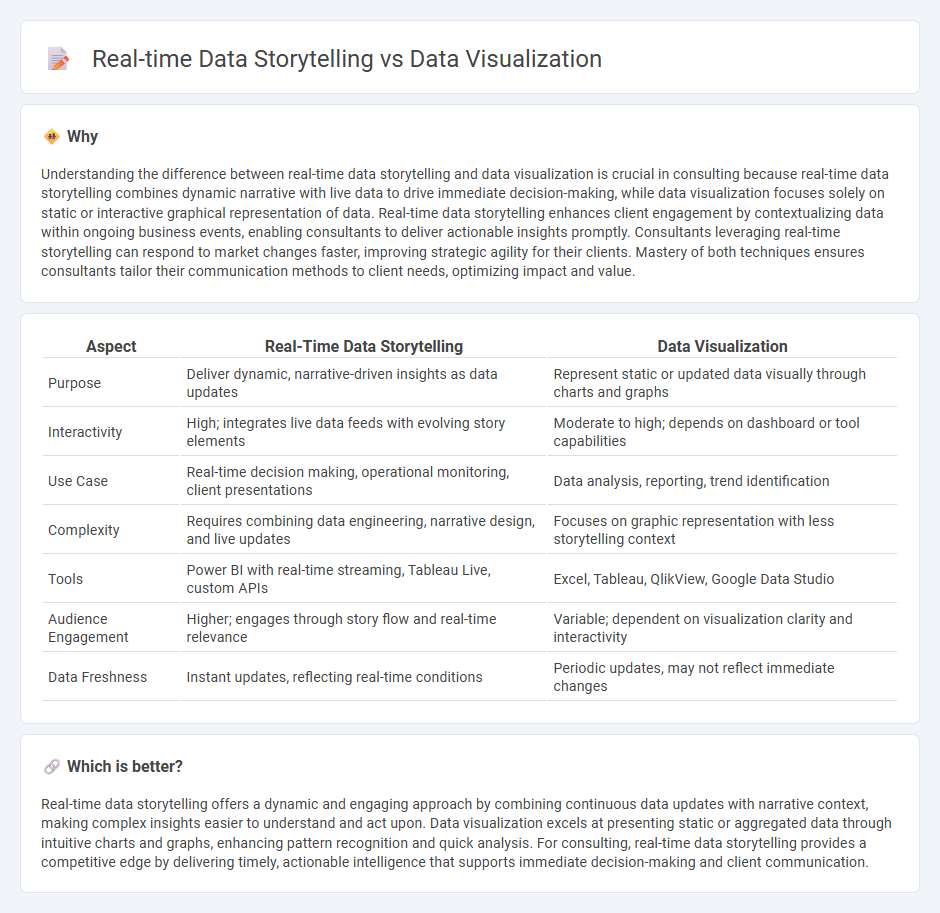
Understanding the difference between real-time data storytelling and data visualization is crucial in consulting because real-time data storytelling combines dynamic narrative with live data to drive immediate decision-making, while data visualization focuses solely on static or interactive graphical representation of data. Real-time data storytelling enhances client engagement by contextualizing data within ongoing business events, enabling consultants to deliver actionable insights promptly. Consultants leveraging real-time storytelling can respond to market changes faster, improving strategic agility for their clients. Mastery of both techniques ensures consultants tailor their communication methods to client needs, optimizing impact and value.
Comparison Table
| Aspect | Real-Time Data Storytelling | Data Visualization |
|---|---|---|
| Purpose | Deliver dynamic, narrative-driven insights as data updates | Represent static or updated data visually through charts and graphs |
| Interactivity | High; integrates live data feeds with evolving story elements | Moderate to high; depends on dashboard or tool capabilities |
| Use Case | Real-time decision making, operational monitoring, client presentations | Data analysis, reporting, trend identification |
| Complexity | Requires combining data engineering, narrative design, and live updates | Focuses on graphic representation with less storytelling context |
| Tools | Power BI with real-time streaming, Tableau Live, custom APIs | Excel, Tableau, QlikView, Google Data Studio |
| Audience Engagement | Higher; engages through story flow and real-time relevance | Variable; dependent on visualization clarity and interactivity |
| Data Freshness | Instant updates, reflecting real-time conditions | Periodic updates, may not reflect immediate changes |
Which is better?
Real-time data storytelling offers a dynamic and engaging approach by combining continuous data updates with narrative context, making complex insights easier to understand and act upon. Data visualization excels at presenting static or aggregated data through intuitive charts and graphs, enhancing pattern recognition and quick analysis. For consulting, real-time data storytelling provides a competitive edge by delivering timely, actionable intelligence that supports immediate decision-making and client communication.
Connection
Real-time data storytelling harnesses dynamic data visualization techniques to transform complex datasets into intuitive narratives that resonate with stakeholders instantly. By integrating interactive charts, graphs, and dashboards, consultants enable decision-makers to grasp insights quickly and drive informed actions. This synergy enhances communication effectiveness, making consulting recommendations more compelling and actionable.
Key Terms
Dashboards
Data visualization transforms complex datasets into graphical formats, making information easier to interpret through charts, graphs, and heat maps. Real-time data storytelling leverages dynamic dashboards that update continuously, enabling immediate insights and proactive decision-making based on live data streams. Explore how interactive dashboards enhance real-time narratives to drive business intelligence and operational agility.
Streaming Analytics
Streaming analytics enables real-time data storytelling by processing continuous data flows to deliver instant insights that static data visualization cannot achieve. Unlike traditional data visualization, which presents historical data in charts or graphs, streaming analytics provides dynamic, context-rich narratives that adapt as new data arrives from sources such as IoT devices, social media, or financial markets. Discover how streaming analytics transforms data visualization into a powerful storytelling tool for proactive decision-making.
Interactive Narratives
Data visualization primarily emphasizes the graphical representation of static or dynamic data sets to identify patterns and insights, whereas real-time data storytelling integrates these visuals within interactive narratives to convey evolving information as events unfold. Interactive narratives leverage user engagement through tools such as dashboards, live updates, and embedded multimedia, creating an immersive experience that deepens comprehension and decision-making. Explore the advantages and techniques of interactive real-time data storytelling to enhance your analytical communication skills.
Source and External Links
What Is Data Visualization? | IBM - Data visualization is the representation of data through graphics such as charts, plots, and infographics to communicate complex data insights clearly and is used in contexts ranging from idea generation to illustrating processes across different teams.
Data and information visualization - Wikipedia - Data visualization graphically presents primarily quantitative raw data using charts, graphs, and maps to help improve understanding, cognition, and decision-making, often distinguishing itself from scientific visualization focused on physical data.
What is Data Visualization and Why is It Important? - GeeksforGeeks - Data visualization uses charts, graphs, and maps to simplify complex information, enabling quick recognition of patterns and trends, thereby supporting faster and smarter decision-making across industries.